Thursday, October 31, 2013

Abandoned Examples

Abandoned Examples

http://michaelmanningtv.blogspot.com/2013/07/on-repurposing-amazing-architectural.html

I really don't like this photo but it is a good example of the theme abandonment because it's literally an abandoned home that people used to live in.

http://www.creativebloq.com/street-art/examples-street-art-612334

This photo is by far one of my favorites.  I really like it; it makes me think of the death of an elderly man, who as stuck in a chair for most of his life.  His feet are still anchored to the chair because they're what made him move and his arms propelled it forward.  He had to abandon his chair in death, leaving it where it sat.  I like the visual analogy that the ghost is still attached to the chair and that the chair is left somewhere that looks like it hasn't been touched in many, many years. 

http://kuwaitschool.blogspot.com/2012/01/extraordinary-ordinary-abandoned-chairs.html

This photo of a desk in an abandoned building made me immediately think of a movie I saw, where all the kids in a psyche ward died in a fire, believed to be caused by a ghost attack.  It makes me wonder who once sat here and what they wrote to who or what kind of mind they had.

http://imgfave.com/collection/57592/abandoned

For some reason, this particular picture reminds me of the victorian ages, with the green, stone walls and the way the windows are shaped.  It makes me think of an abandoned castle or something, somewhere in Europe. 

http://www.dcourier.com/main.asp?SectionID=74&SubsectionID=104&ArticleID=119654

This photo is extremely emotional for me to look at, as this breed of dog (Pit Bulls) are often misunderstood and abandoned / left to die when they become too much to handle. 

http://en.wikipedia.org/wiki/Abandonment

I like this photo mainly because it's black and white; it also reminds me of a scary story my grandfather once told me when I was a young girl.

http://indulgy.com/post/2yVPxzYPN1/abandoned-card-catalogs-later-turned-int

I once watched a supernatural horror show, and there was an abandoned post office.  This photo reminds me of the ghosts opening and closing the drawers, trying to find letters their significant other wrote and they never received. 

http://graphicssoft.about.com/u/sty/galleries/hdr-images/Abandoned-Gas-Station-in-Center-Hill-Florida-by-Shane.htm

This is a good example of abandonment because it gives off a spooky, cob-web kind of feeling.  When I first look at it, I thought it was straight out of a horror novel, as it reminded me of one of the settings of a book I read once, where a house burned down and the family abandoned the property. 

http://labs.radiesel.com/?paged=2

This photo reminds me of something my youngest cousin lost a couple weeks ago.  It looks as if a child would've played with this stuffed animal and they must've forgotten about it somewhere, like a bedroom or an old house, so here it sits, to be photographed. 
http://kuwaitschool.blogspot.com/2012/01/extraordinary-ordinary-abandoned-chairs.html

I feel this photo is a good example of abandonment because no one is sitting in this chair, which is surrounded by dirt and a lot of broken pieces of concrete and looks as if it hasn't been touched in years. 

Monday, October 28, 2013

Professional Photographers


Michael Kenna


http://artperson.org/usa/michaelkenna/

http://colt-rane.com/michael-kenna/
     I find both of these photos by Michael Kenna interesting.  I can connect with the first one in the sense that not everything is in the same speed of change.  Different things are far away, hence the blur, and other things are just in reach, hence the clarity at the bottom.  In the second one, the sky seems to be going fast and all over the place, whereas the ground is stable and unmoving, clear to the eye.  When I first saw the second photo, it reminded me of my life - where everything seems to be fast and out of reach, but some of the things that can help me get to that far out place are right in reach. 

Jim Brandenburg


picture one: http://www.amateurphotographer.co.uk/how-to/icons-of-photography/539374/photo-insight-with-jim-brandenburg-young-fox
picture two: http://photography.nationalgeographic.com/photography/photographers/photographer-jim-brandenurg/

     I find Jim Brandenburg's technique and style of photography interesting.  Firstly, I can relate to the first picture by feeling stuck and having too much motion, excitement and life surrounding me.  The fox stands alone in a feel of living things, but yet, it looks scared and somewhat dead in it's eyes.  In the second photo, I can relate to the wolf by being only half seen.  Everyone I know only sees one side of me because I don't let my guard down; it's those select few that decide to look beyond the one side and see me for who I really am.

Friday, October 25, 2013

Animal Morph Samples


These are all animals morphs and I worked hard on them.  The only two that really worked out well was the first and last; for the second one, I should've picked a different human face to morph. 

Tuesday, October 22, 2013

Texture Examples

Texture Examples


http://th09.deviantart.net/fs39/PRE/f/2008/331/6/c/Scratch_Texture_by_markopolio_stock.jpg


http://fc08.deviantart.net/fs10/i/2006/134/4/f/texture_leaves_by_kuschelirmel_stock.jpg


http://fotobg.ru/upload/img1349370450.jpg


http://static3.depositphotos.com/1005348/198/i/950/depositphotos_1987290-Cracked-ground-texture.jpg


http://wallpicshd.com/texture-background-wallpaper-full-hd-free.html


http://knowledgeoverflow.com/wp-content/uploads/2013/01/tree_stump_texture.jpg


http://cdn.designinstruct.com/files/275-pebble_textures/pebble_texture_05.jpg


http://upload.wikimedia.org/wikipedia/commons/4/4f/Colors_and_texture_of_a_brick_ground_artlibre_jnl.png


www.bene.be


http://upload.wikimedia.org/wikipedia/commons/c/cc/Brick_texture_-_Saint-Omer_(Pas-de-Calais)_-_01.JPG

Each of these photos is a good example of texture.  

Friday, October 18, 2013

Select Samples


These photos are all edited and select images that had to have an insert from another image.  I found it extremely interesting to use the tools but now, my eyes burn and I'm sad.

Tuesday, October 15, 2013

Replace The Sky


I personally think this looks like I drew the tree branch over the sky photo.  I really don't like replacing the sky in photos because it takes up a lot of time and it looks fake. 


It doesn't even look like I replaced the sky but I did.  I only reverted it to black and white so no one could tell there was a difference in the pigment of the sky. 

Replace The Sky Samples


These photos are my sample replace the skies. 

Wednesday, October 9, 2013

Light Examples

Light Examples


Personally, I really like this photo.  Not only is it an unusual shot, but it was taken underwater and the light reflects off of the ground.  I kind of want to know what it looks like when it isn't black and white, and that's probably the only thing I would change in the picture. 


http://webdesignledger.com/inspiration/30-magical-examples-of-natural-light-photography

I like this photo; it's antique looking and the light is visible.  You can see where it casts across the picture and the dead leaves / flowers in the picture on the ground give it a sad kind of mood.  The only thing that bothers me is that it sort of looks fake. 


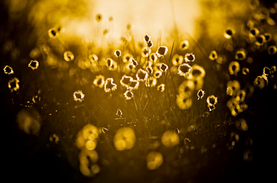
I don't like this picture.  It's overused and there's too much yellow in it.  There isn't much color and it also looks like the contrast is turned way up.  Personally, I wouldn't take this picture. 


photo from http://my.opera.com/vikaskhan/albums/showpic.dml?album=4208532&picture=63062712

I don't like this picture very much.  It's too dark and there isn't any color.


I don't like this one, either, for the same reasons as above.  I feel like both pictures would've been better with color or if the contrast wasn't turned up as much. 


photos by Henry Jones

I'm not a fan of this picture but the light in it is good and there's a lot of color.  I would've tried doing this one in black and white but the contrast is too high for my liking. 

Tuesday, October 8, 2013

Depth of Field Examples

Wide Depth of Field Examples


photo from http://www.cambridgeincolour.com/tutorials/wide-angle-lenses.htm

I picked this photo because I liked how different it is from most pictures I see of the sky.  The colors are different and it isn't an overused kind of picture.  


photo from chubsnap.com

Despite everything being in focus in this photo, I feel like the subject was the lighthouse.  It blends in nicely with the rest of the photo and I don't see anything wrong with it. 


photo from http://www.jclarksonphotography.com/articles/aperturedepthoffield.php

I'm not much of a fan of this photo.  It's an overused angle; the flowers aren't in focus and in a lot of places, it's too sharp or too blurred.  The colors are all the same and I really rather hate it. 

Narrow Depth of Field Examples


photo by Darren Rowse

I don't see many photos with only half a person in them, so this was interesting.  Not only is it an example of narrow depth of field, it's an example of leading lines. 


photo by unknown

This photo is one of my favorites.  It looks fake, but it's easy to tell it isn't.  The only thing in focus is the water drop; the other areas of the photo aren't; not even the tip of the leaf is in focus. 


photo by Yogesh Singh

I enjoy this photo, but it isn't one of my favorites.  There are a lot of pictures like this and even though I'm not a huge fan of them, I think it's a good picture.  The leaf is crisp whereas the background is blurred.  I feel like this is a perfect example of narrow depth of field. 

Tuesday, October 1, 2013

Photography of Light

Photography of Light


Shutter: 1/10, Aperture: f/5.3, Max Aperture: f/3.2, Focal Length: 11.6mm, ISO Speed: 400

I tried to take this photo once right before this one but my flash went off.  It took me a good ten minutes of figuring out what to set to get the picture to work just right and it was irritating, but I got it after awhile.  I like the coloring, though I wanted the back to be a darker, cherry kind of red.  If I were to retake it, I would try and make the edges of the leaf clearer and / or use a different colored leaf. 


Shutter: 1/500, Aperture: f/8.5, Max Aperture: f/3.2, Focal Length: 5.1mm, ISO Speed: 80

While I was taking this, I thought, What could be a better example of light other than the picture of an actual light bulb?  When I edited this picture, to filter back in the color I saw verses what the camera saw, it didn't look this way.  When I uploaded it, the picture didn't have the background of the light container and the dust wasn't as visible.  To me, I think it's pretty interesting, and I like it. 


Shutter: 1/100, Aperture: f/3.4, Max Aperture: f/3.2, Focal Length: 5.1mm, ISO Speed: 80

This is a retake of my other photo and I don't really mind it.  I took it around the same time, but I think I like the first photo better.  To me, retakes seemed to hold a copy-cat kind of feeling. 


Shutter: 1/160, Aperture: f/4.2, Max Aperture: f/3.2, Focal Length: 7.7mm, ISO Speed: 80

I don't really like this photo because the trees didn't come out the way I wanted them too and the sun wasn't as visible in the background, but nevertheless, I tried. 


Shutter: 1/30, Aperture: f/3.2, Max Aperture: f/3.2, Focal Length: 4.6mm, ISO Speed: 250

This photo reminds me of a camera effect for faces.  I like it, just because the lightbulb isn't visible but the actual light is.  However, I'm not exactly proud of it because the seams of the light cover are visible.