Light Examples
Personally, I really like this photo. Not only is it an unusual shot, but it was taken underwater and the light reflects off of the ground. I kind of want to know what it looks like when it isn't black and white, and that's probably the only thing I would change in the picture.
http://webdesignledger.com/inspiration/30-magical-examples-of-natural-light-photography
I like this photo; it's antique looking and the light is visible. You can see where it casts across the picture and the dead leaves / flowers in the picture on the ground give it a sad kind of mood. The only thing that bothers me is that it sort of looks fake.
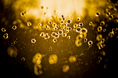
I don't like this picture. It's overused and there's too much yellow in it. There isn't much color and it also looks like the contrast is turned way up. Personally, I wouldn't take this picture.
photo from http://my.opera.com/vikaskhan/albums/showpic.dml?album=4208532&picture=63062712
I don't like this picture very much. It's too dark and there isn't any color.
I don't like this one, either, for the same reasons as above. I feel like both pictures would've been better with color or if the contrast wasn't turned up as much.
photos by Henry Jones
I'm not a fan of this picture but the light in it is good and there's a lot of color. I would've tried doing this one in black and white but the contrast is too high for my liking.


No comments:
Post a Comment